MichaelMassie.com/projects
Project Journal
Augmented Reality Assistance For Financial Clarity
Recently a pretty fun video popped up (YouTube Link) around using Apple’s AR to illuminate transactions to provide better clarity and transparency.
While novel in concept with today’s technology - see: holding up your iPhone to look at your card - the reality is much trickier… beyond it just even being more steps than opening the Wallet App.
Roughly 2 years ago, a teammate, Tony, and myself here on Northwestern Mutual’s R&D team cracked open a developer edition Microsoft HoloLens and ran some similar experiments.

It was quickly apparent that requiring people to take out their phone with credit card in hand while also in the checkout line, was a lacking experience and a contrived interaction. The interaction thrives once a pair of socially acceptable AR enabled glasses hit the market.
What did we learn in this experiment?
We’d all love a clean interface and a nice beech wood table to have as a backdrop but when used in the real world, checkout lines are visually cluttered with ads, PoS hardware, etc. Floating content with no background image is visually more attractive in controlled backgrounds, but once in the wild you need something behind the content in order to filter out the noise behind it.
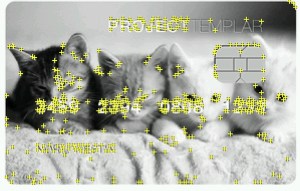
On the topic of visual noise, the current iterations of AR goggles need visually recognizable points (a lot) to recognize things it knows. The driving reason we chose a nod to the 90’s Discover Card boom of gaudy personalized credit cards images - in our case the “Kitty Card” - was to make sure it had plenty of data.

Content placement created another design issue. Where does it render that it won’t obstruct the user and their primary task? For example, on the first prototype I had the pop-up to the right of the card and chip. Worked fine just looking, but when going thru some interactive play the pop-up obstructed the ability to see the card reader when the user would want to pay.
Granted this tech is all about 5 years out, but today’s minimalist Apple Card probably won’t cut it for enough recognizable data points. Based on these timelines too, will the life of the current credit card and timeline of AR shrunk to standard glasses ever intersect? Never-the-less it was an exciting project to test out and conceptualize.
What was left?
Where we did stop short and I wish I hadn’t was to design in a few tiers of content. When the HoloLens recognizes the wallet, you get a holistic view of your information, the 1000 ft view, and the current state of your spending goals. When you pull out a loyalty card, credit card, etc., the information drills down to only the content in that account.
From prior work with Ringly, Digipig, and on a more near time opportunity, I also stopped short of embedding a single LED into a wallet that could provide a temperature color spectrum based on daily/weekly spending goals to inform users with a glanceable UI.
tags: Finance - Spending - Innovation - AR